
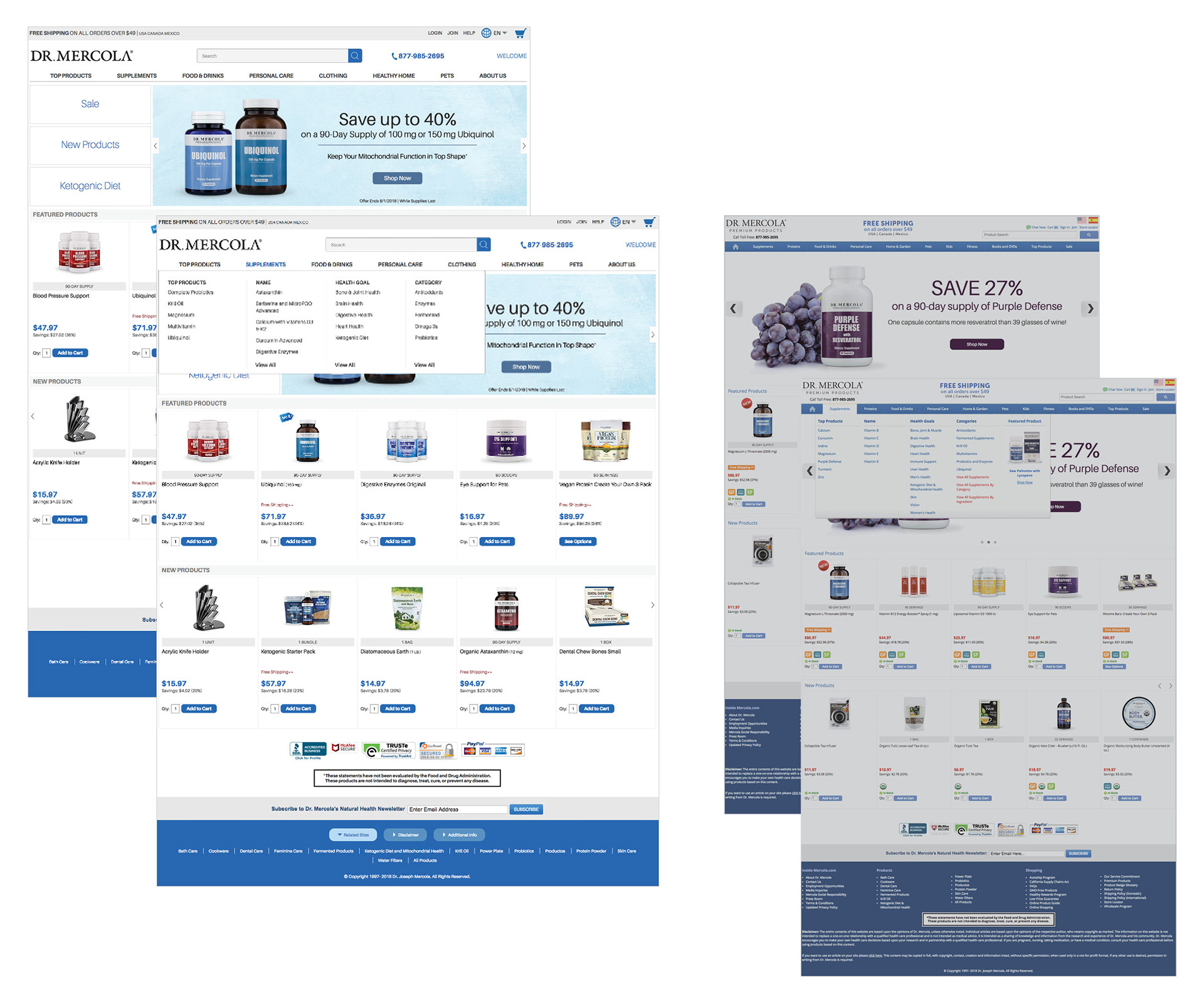
This view of the updated home page (left) shows a more prominent main navigation using a larger typeface and fewer choices.
I enlarged the logo and decluttered the top of the page. Making "free shipping" and the language choice less prominent while keeping the search button and sale button very easy to find. Streamlining the number of colors involved, especially in the mouse-over drop-down menu, allows the user to more easily scan the navigation choices.
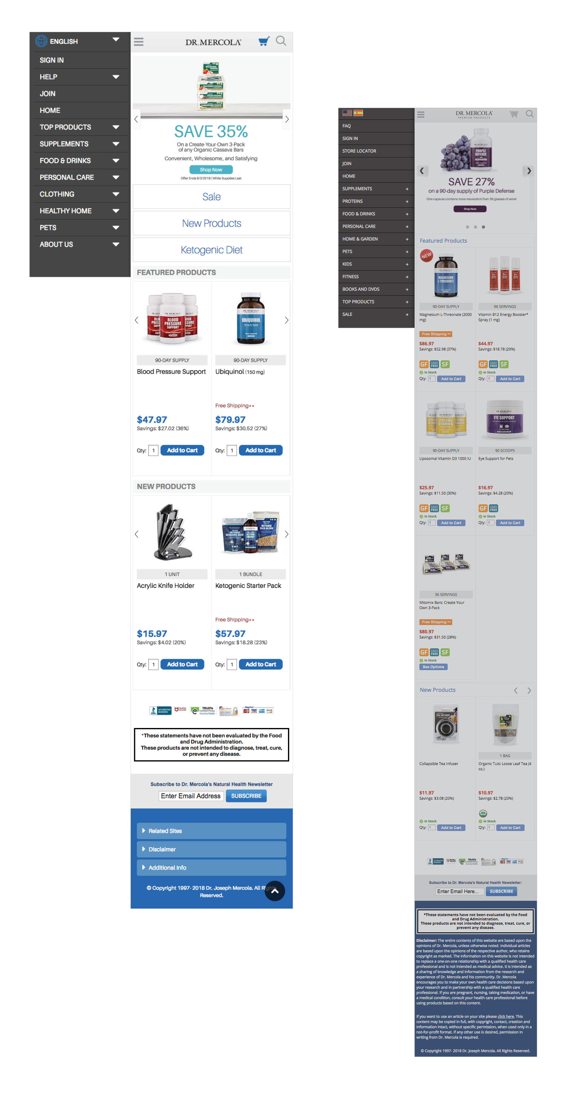
Mobile view of the updated home page and hamburger navigation (above left) shows fewer choices, along with downward arrows to indicate more information available. The three large buttons under the top banner will be used not only to give more prominence to the sale items, but can be changed out to emphasize any promotion or product. Communicated with the developers and CMS teams to streamline the process of creating/updating topics from the marketing plan.
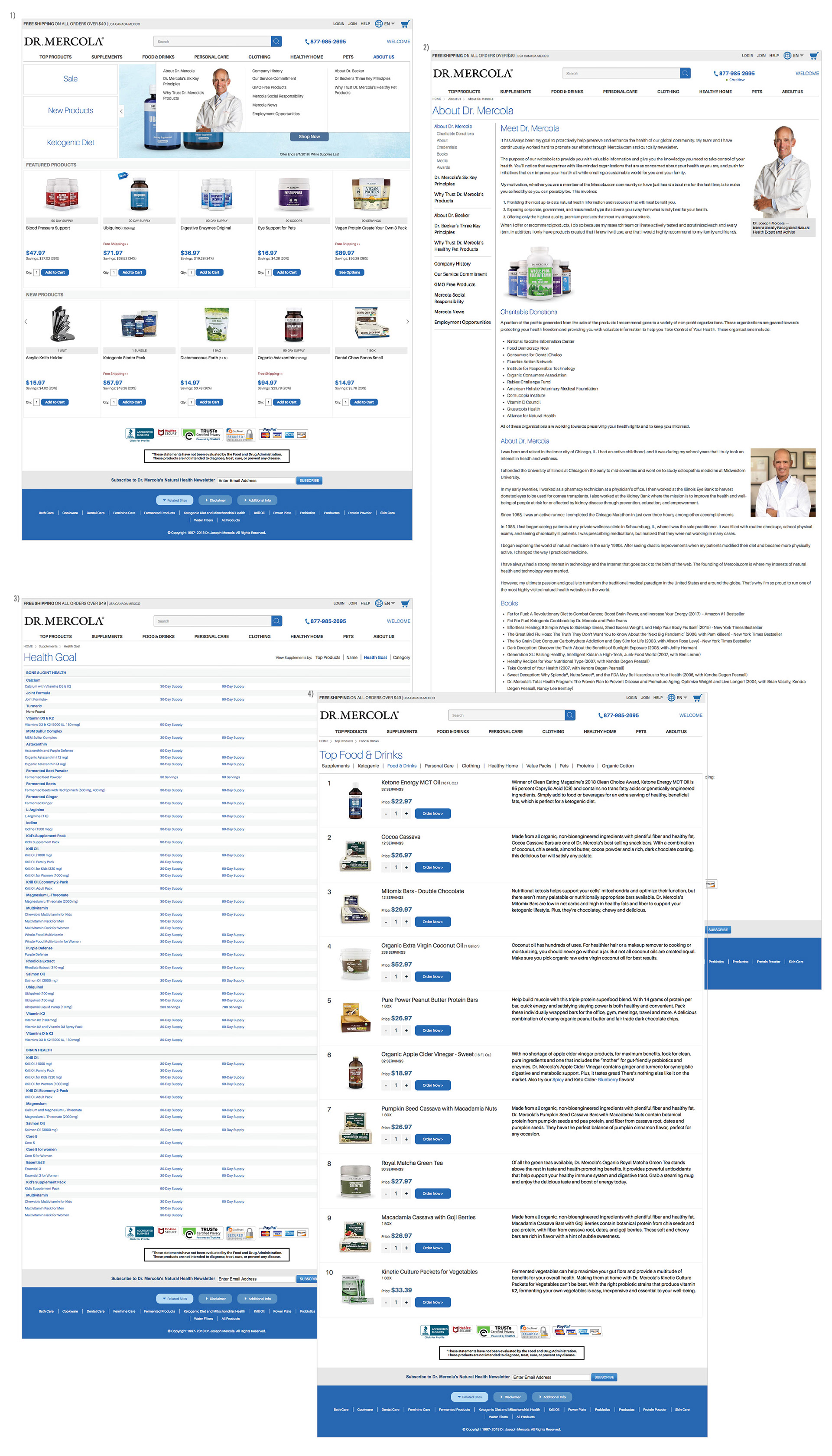
These four pages above show: (1) the much needed About Us dropdown menu and (2) first page. This section describes more about Dr. Mercola and how he approaches his work and the creation of his products. These were previously available on other related sites, but not pulled together in a way better understood by consumers. The (3) Health Goal and "View All" pages were added to help streamline the process for consumers to find products that they are looking for in any given topic and also see/discover the quantity available for each product in fewer clicks. (4) Top Products was redesigned to help emphasize the actual top 10 products of any given topic (ie. Supplements, Food & Drink, etc.). Here I brought more emphasis to the product and its description while keeping the option to "Order Now" readily available.
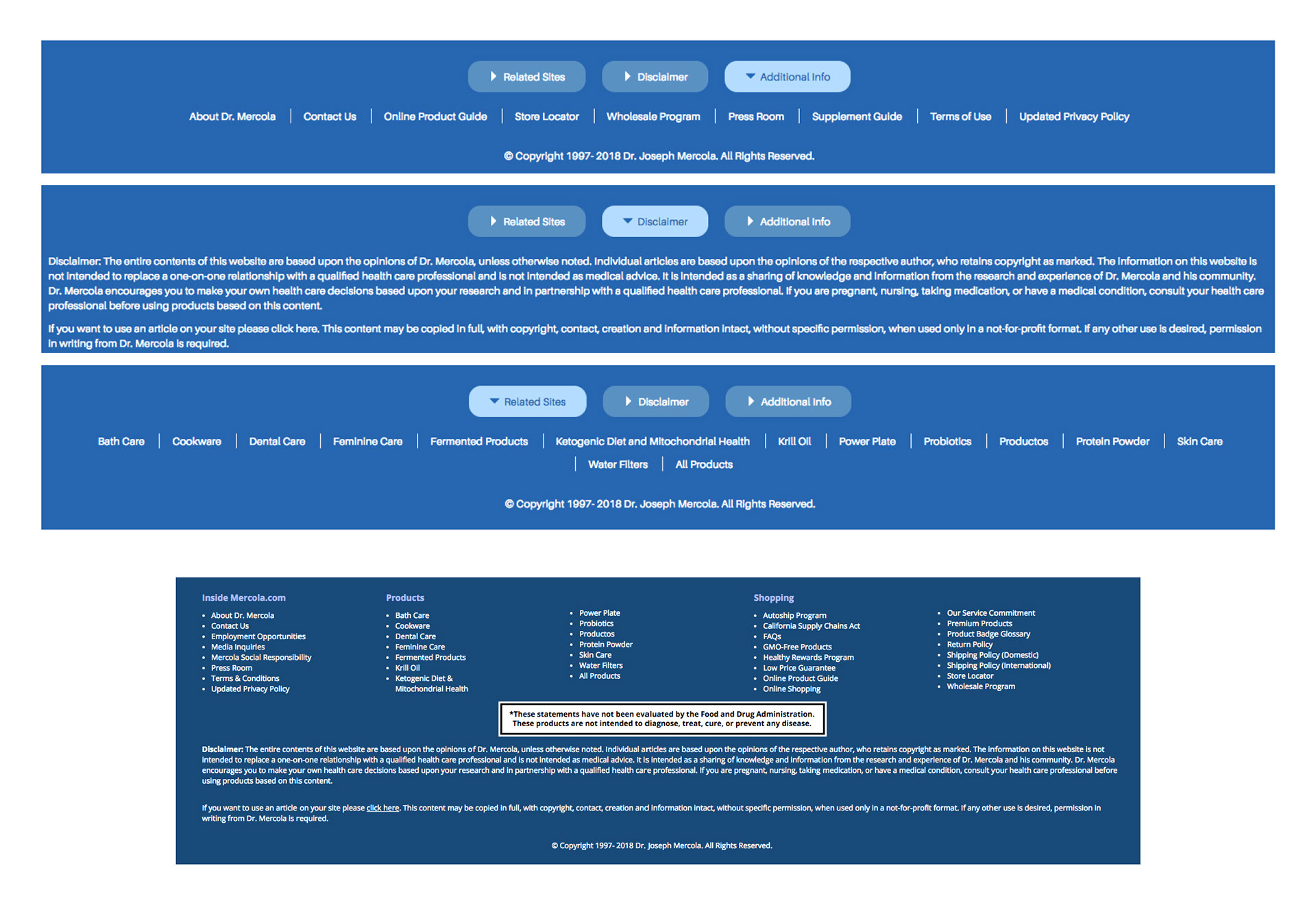
These 3 (above) blue boxes show how I helped redesign the footer of the retail site. Instead of showing everything all at once (old site footer, bottom dark blue box) I divided the information up into 3 sections which helped focus customers attention on what they may be looking for.