
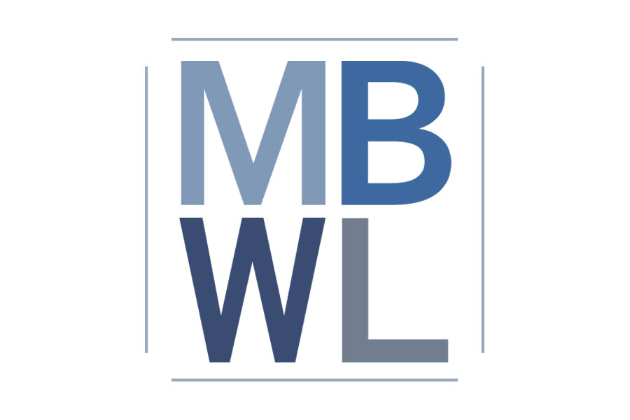
Above is the final four-letter logo mark designed to reflect the partner’s modern,
yet traditional approach to law.
yet traditional approach to law.
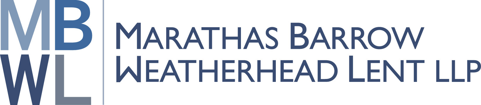
Above is the full logo for the firm. It updates the look to a more
contemporary graphical style than the previous logo.
contemporary graphical style than the previous logo.
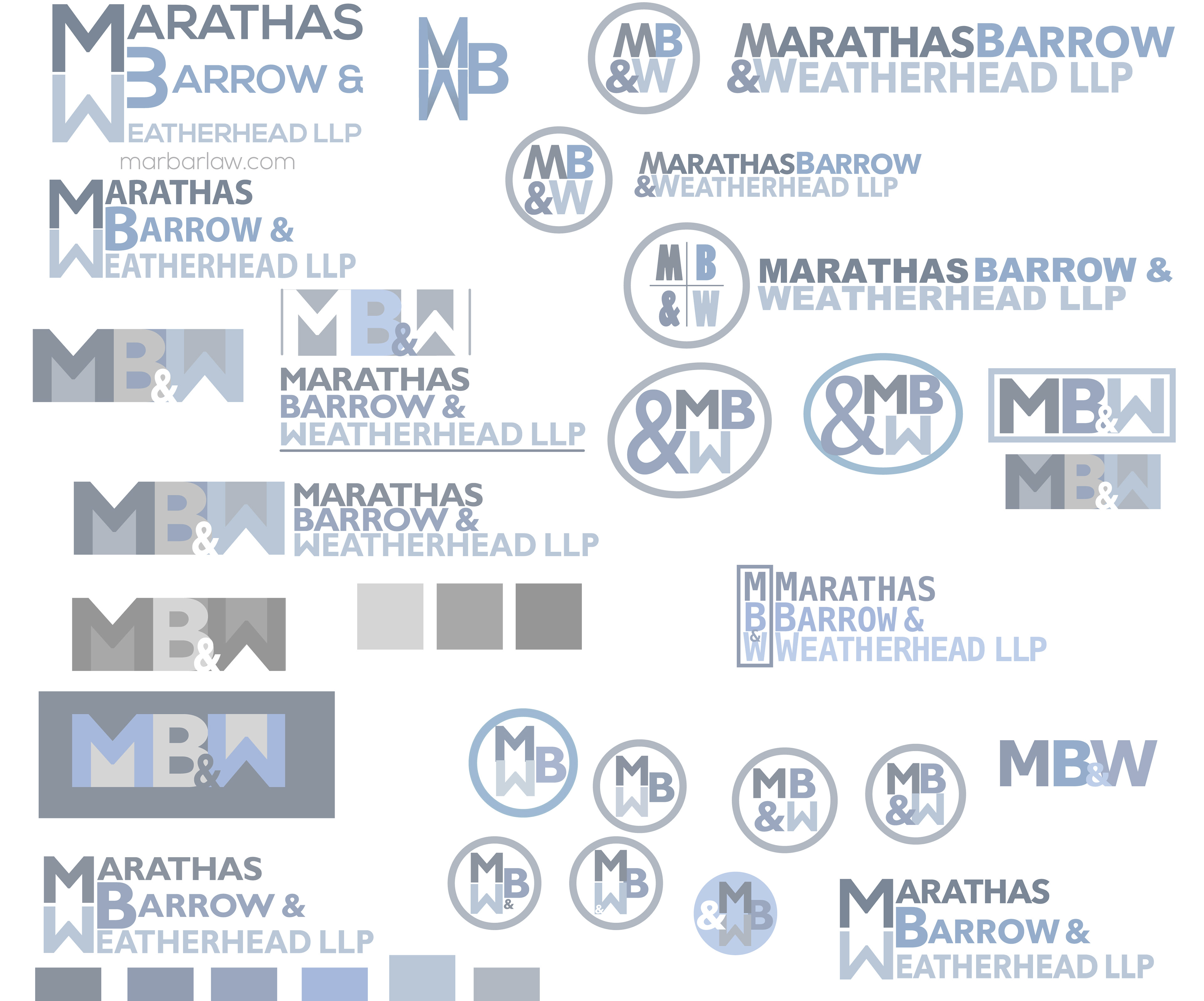
ABOVE, sketches illustrate a number of different ideas used to generate the new logo. This shows my thought/creative process for creating logos. Some of the logos shown here attempted to match the former existing logo while fixing some of the challenges of the original. They helped the client recognize the stronger design in the logo that was ultimately selected.