
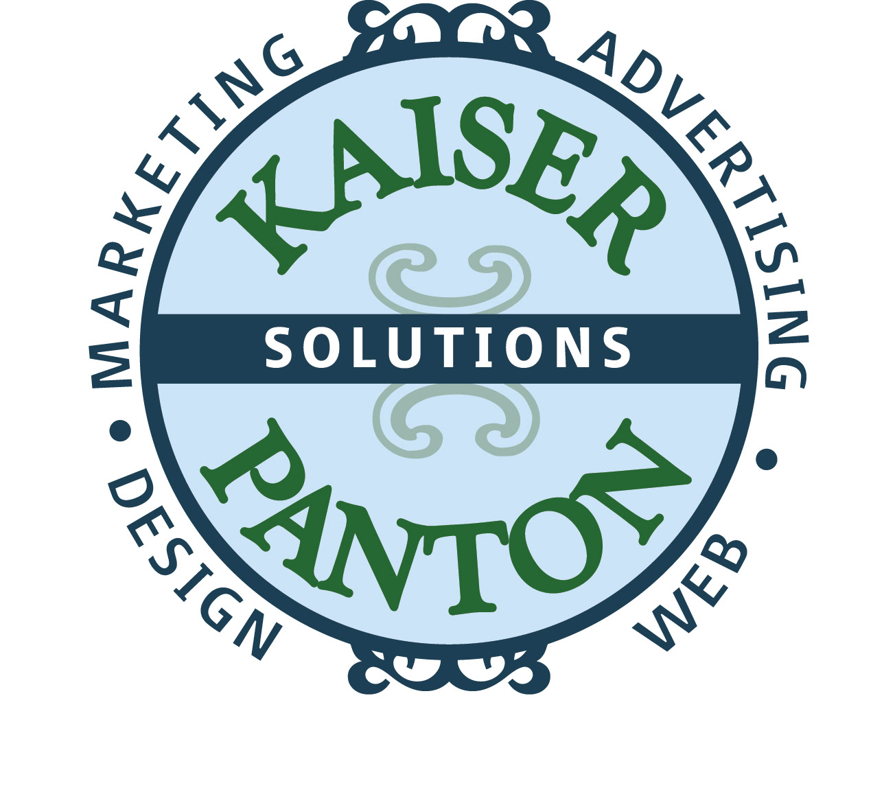
ABOVE is the final logo selected for this marketing firm that offers many services. More literal elements of the targeted market (agriculture and produce) were dropped in favor of a more straightforward look that included the partner’s names in a more general, classic style.

ABOVE, examples show the font selection process along with the different styles attempted in creating this logo.
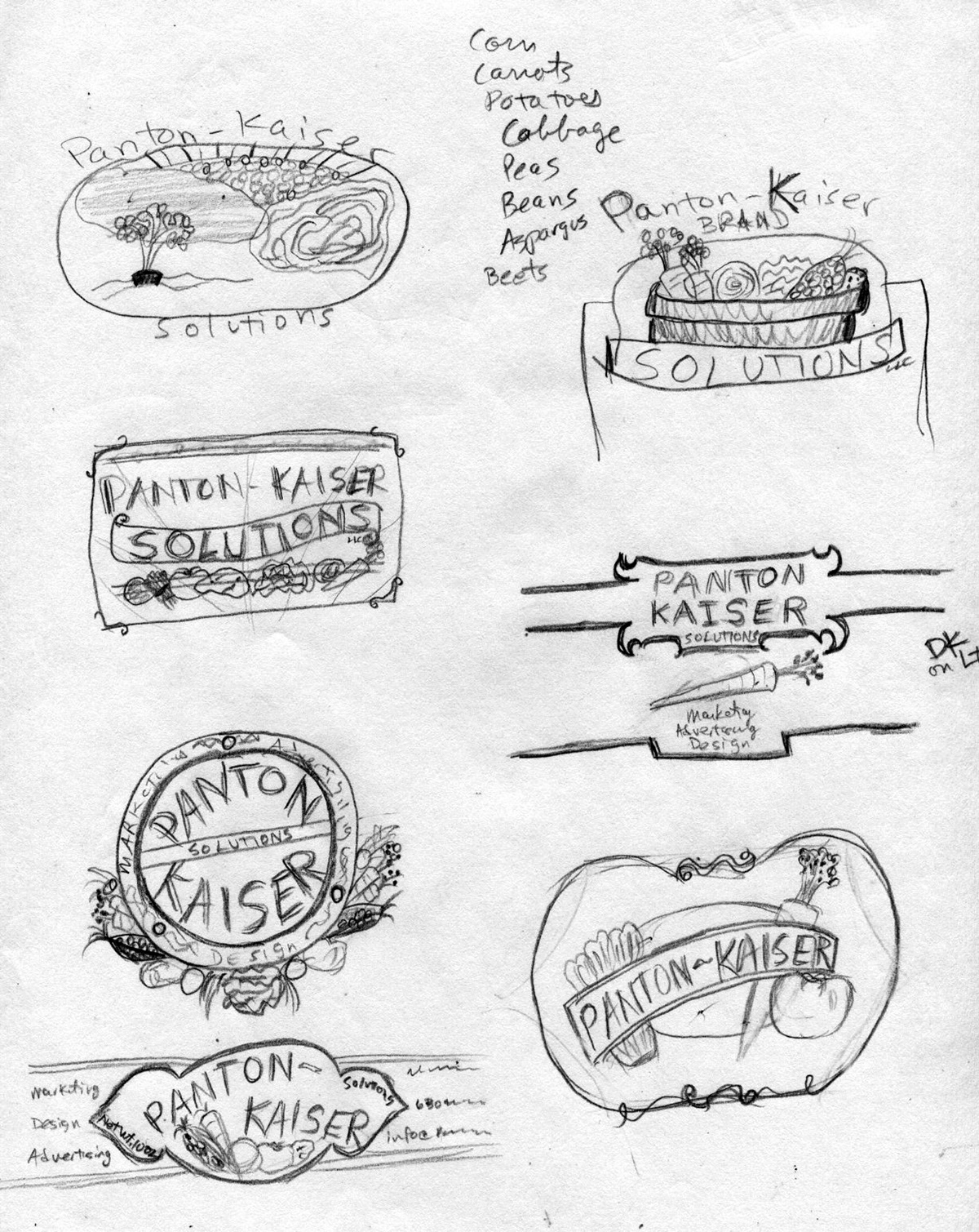
ABOVE are the freehand sketches I used in my initial conversations with the client to generate ideas for this logo.

ABOVE are some of the business card layouts that were explored to narrow down
bigger questions deciding color and size options.
bigger questions deciding color and size options.