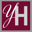
ABOVE, the selected logo successfully combines a feminine initial letter with a comfortable serif face to project professionalism.
ABOVE illustrates the many different fonts and combinations explored for this project. This process helped narrow the options until the final combination was found to create a logo that most effectively communicates the sensibilities of the owner and company.
